Summary

CLIENT

This was a personal project completed during a 10 week full time course at General Assembly in Melbourne.

THE PROBLEM

Keeping indoor plants alive and keeping track of their needs is difficult.

THE SOLUTION

The outcome was an iOS mobile app that helped people keep indoor plants alive and flourishing by pairing with a hardware sensor in the plant. The design outcome was a high fidelity wireframe prototype.

SCOPE

1 week

MY ROLE

As this was a personal project I was fully responsible for all aspects of the UX process.

TOOLS

Sketch, InVision, Adobe Illustrator, Adobe InDesign, Adobe Photoshop, pen and paper and LOTS of post-it notes.


The Whole Story

Competitor Analysis

As expected I looked at gardening apps however I also wanted to look at apps that had rich feature sets in tracking and organising. My reasoning for this was based on my experience and assumptions with indoor plants. I foresaw tracking plants and organising their needs with notifications in some form was going to be a likely solution.

 
competitor logos.jpg
 

Key Takeaways

  • Some apps have very a strong community forum where people can ask questions relating to plants.
  • There are hardware plant sensors in the market that pair with apps, however they are very expensive and the paired apps have no option to track plants without using the sensor.
  • When tracking and displaying data, context is very important. Some apps display walls of data and graphs however they don't communicate why the information is meaningful to the user. 

User interviews

5 people interviewed including a horticulturist.

Key Topics for User Interviews

  • How do people behave around indoor plants? I needed to understand users' current strategies to keep plants alive and find their current pain points.
  • Why do people’s indoor plants die? I wanted to find out the main reasons indoor plants might die and design solutions to address them.
  • Why do people love indoor plants? I was curious about users' motivation for owning indoor plants and their connection to them.

The feedback I received from user interviews was concise with no conflicting opinions. This made defining my user group straightforward and I had a really clear vision of the user I was designing for.

 
Image uploaded from iOS.jpg
 

Key Findings

Owning plants is emotionally fulfilling.

“Seeing plants grow gives me a sense of fulfilment.”
“I love plants and I just want to be a good plant mum.”
“Nurturing something and watching it grow gives me a sense of achievement.”

There is a lot of anxiety around how to care for plants and their needs.

“I don’t have a strategy of taking care of plants, I just randomly look at them and try to guess if they need watering.”
“I never know the amount of water I should add to the plant.”
“I forget to water my plants.”

Negative feelings of guilt around dead plants.

“I have failed them.”
“If I can’t keep a plant alive how am I going to care for a pet or human baby.”
“They [dead plants] feel like a reflection of how much I have my shit together.”

Ideation

Mental Model + Feature Prioritisation

I was able to extract lots of ideas from a basic mental model so did not employ other ideation techniques.

A high/low impact and expected/unexpected matrix was used for feature prioritisation.


Mental model

Feature prioritisation matrix


The Core Idea

A lot of the pain points facing people could be addressed with a sensor in the plant that paired with an app. The sensor can detect moisture, temperature, light and soil quality and let the user know if any of these areas need addressing.

Another important concept was around the idea of language and tone. Some key findings really demonstrated how connected people were with their plants. By having a nurturing and personal tone throughout, the app could help users feel closer to their plants.

 
IMG_2916.JPG
 

Prototyping

Usability Testing

  • 5 usability tests with paper prototypes.

  • 6 usability tests with wire frame prototypes.

  • 5 iterations made between usability tests.

Key Iterations

Accidental Navigation

My initial paper prototypes returned an interesting finding when my navigation was interpreted differently to how I intended. So I ran with it and developed the users' idea throughout the iteration process which worked really well after a few more tweaks. 

 
paper_home_2.jpg

1. Initial idea with plant icons at top and plant list under it.

paper_home_3.jpg

2. Revised after first useability test to use plant icons as navigation.

home_2.png

3. Refined in Sketch and added other navigation.

home_3.png

4. Cleaned UI further after testing and changed navigation language.


Divide and Conquer

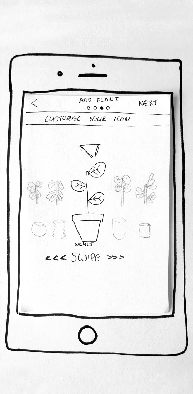
When adding a plant to the app you had the option of choosing a custom icon and name. I played around with a few ways to do this interaction and settled on a swiping action. All users from the paper prototype onward understood the swiping interaction however very few realised the plant leaves and the pot swiped independently. I starting increasing the affordance until I settled on the below final proposed design with the top and bottom icons in their own boxes with a dotted line between them. One consideration is that if the user still does not understand the interaction, it will only take them one swipe to realise the plant and the pot move independently.

 
paper_cust_1.jpg

1. Sketched out how icon selection might work.

cust_1.png

2. People did not realise the top and bottom were independent.

cust_2.png

3. More people understood, however a minority didn’t.

cust_3.png

4. Final proposed design with testing needed.

Final Prototype


Going forward with the prototype

Need to Add

  • A manual reminder for watering.
  • Photo and information tabs.
  • An encyclopedia.
  • Settings.

Need to Test

  • Different nurturing language.
  • Interactions around picking the icon and name.
  • Interactions around the “My Plants” home screen.

Market potential

  • Selling sensor with the app as a companion.
  • Free app with in-app prompts to buy the hardware sensor.
  • Sensor could be sold with actual indoor plants, possibly as a combo deal.

Key Learnings

Never assume your design is intuitive when a user doesn't understand an interaction or idea. Don't curse the user, curse the design! This was heavily reinforced when designing the icon selection in the app. I thought it was painfully obvious how the interaction worked but time after time my users proved me wrong.