Summary


CLIENT

This project was completed during a 10 week full time course at General Assembly in Melbourne.

THE Goal

Identify users’ pain points with the current Public Transport Victoria mobile app and design an iOS app to address their problems, with an emphasis on better supporting multimodal travel and promoting walking and cycling.

THE SOLUTION

The outcome was a high fidelity wireframe prototype demonstrating our core concept of "personalisation".


    SCOPE + Team

    2 weeks with a team of 3 UX designers.

    MY ROLE

    Our team of 3 contributed to all aspects of the UX design process from research to ideation and prototyping. We started to specialise towards the end of the project, with my focus being prototyping, usability testing and iteration.

    TOOLS

    Sketch, InVision, Adobe Illustrator, Adobe InDesign, Adobe Photoshop, pen and paper and LOTS of post-it notes.


    The Whole Story

    Competitor Analysis

    We analysed other transport apps to identify what was already out there and find potential gaps in the market.

    Key takeaways were:

    • The experience is often designed around the map interface.
    • Most travel apps are poor at identifying cycling options.
    • Having easy access to common trips is a great feature that not all apps take advantage of.
     
     
    competitor.jpg


    User Interviews and Observation


    Starting with topic maps we then developed a discussion guide for user interviews. A total of 12 people were interviewed with user groups including daily commuters, V-line commuters and tourists. I led 5 of the interviews as well as 2 contextual interviews observing people using the current PTV app.


    Topic Maps — Used to help us craft our research.

    Synthesising Research — Affinity Map and Persona Spectrum.


    Key Findings from Research


    Difficult to navigate app — The overall information architecture of the current app is confusing with some users not realising some features even existed.

    No Myki integration — There was a clear desire from users to have Myki integration built into the app with features such as ability to view current balance and top-up.

    Poor location search — Users were very frustrated when search terms like landmarks or business names were not recognised by predictive search.

    Inaccurate live tracking — Users did not trust live tracking as they often found it was incorrect with one user having the experience of tracking information on the app differing from tracking information at the train station.

    Barriers to bike riding — By far the biggest barrier people had to bike riding was safety concerns. People did not feel safe riding bikes on busy city streets and sharing lanes with cars.

    Motivated by health benefits — A big motivation for people to choose walking or riding over public transport or driving was the health benefits.


    Personas

    We created personas to help us synthesise the research into archetypes.

    bigstock-Portrait-Of-A-Beautiful-Mature-7014470.jpg

    Claire 

    38, Super Organised / Business Analyst

    Claire is a very organised business professional. Her job is based in the city and she commutes everyday from her house in Ballarat on a V-line train. As she plans every detail in her life, Claire likes to know when there is any disruptions to her journey.

    Frustrations

    • Public transport tracking data is inaccurate.
    • Disruptions and common trips are hard to read and navigate to.
    • Not having Myki functionality in the PTV app is not ideal.
    • Carrying lots of shopping bags or large items on public transport is hard.

    Needs

    • Clear ways to organise and visualise the trip.
    • Easy access to common trips and their information.
    • Top up and manage her Myki through the PTV app.
    • A better way to accommodate shopping on public transport.
    b9b82dff5b8f4332477e3801327c57e5--male-models-night.jpg

    Raj 

    28, Outdoor Enthusiast / Student

    Raj is a student in Wagga Wagga and occasionally visits Melbourne as a tourist. He commonly uses public transport to get around and is a keen cyclist at home but feels unsafe riding in the city.

    Frustrations

    • Not having a safe environment to ride a bike.
    • PTV app doesn’t recognise landmarks and map is not interactive.
    • It’s hard to compare different travel types, for example, public transport, uber, cycling.

    Needs

    • A safe way to navigate or ride around the city and inner city.
    • Increased map functionality with better searchable locations.
    • Technology that provides multimodal travel options.
    il_fullxfull.1310454008_ppef.jpg

    Bonnie 

    25, Health Nut / Part-time Barista

    Bonnie is a young, free spirited, independent woman. She is very involved in her community so she doesn’t live too far away from her common destinations and walking is normally an option. Bonnie sometimes avoids public transport when it is overcrowded and busy.

    Frustrations

    • Crowded transport.
    • Over complicated technology.
    • Getting a good balance between walking and public transport.

    Needs

    • A way to avoid or navigate crowded transport.
    • Simple navigation with straightforward feature interactions.
    • A way to balance her trip, for example, walking to public transport ratio.
     

    Ideation

    A concept we conceived early on was an idea around humanising transport. This included features like giving each train, tram and bus a unique name and icon. Users could then directly interact with the common transport they use and get direct notifications that were relevant to them.

    Our reasoning was based on the idea that people are more likely to take bad news like delays better from something that has been personified. Users are also more likely to take on suggestions like walking or cycling instead of driving from language that is more conversational such as if the personified transport had a chatbot feature.

    We decided to test some of these core concepts around humanising transport in a quick paper prototype and quickly learned that people just didn’t get into it. 

    “This feels like a gimmick.”
    “All these names for trains just sound confusing.”

    So after what we thought was a genius idea crashed and burned in testing, we tried to break down exactly what parts users didn’t like. We discovered users felt uncomfortable humanising transport but unpacking it further we realised that concept was just a wrapper around the core idea of personalisation.


    Image uploaded from iOS.jpg


    Personalisation

    We discovered that every user has a unique journey and they only want to access information relevant to them. This helped us design a cohesive feature set as we started to address some of the users’ needs and frustrations.

    A core technology this concept required was machine learning. The app would track and learn your common trips and key information that was important to you and then send you relevant notifications or display that information on the interface.

    This base helped us address some of the biggest frustrations users had, including:

    • Claire's need for glanceable information and quick access to common trip information. Her most common use case of discovery around disruptions would also be addressed with notifications.
    • Raj’s needs around personalised suggestions for safe cycing routes and multimodal travel options. Based on a custom search criteria Raj can find a travel route based on his personal preferences.
    • Bonnie’s dislike of crowded transport could be addressed with personalised notifications about the least crowded route. Through machine learning techniques the app could also see her walking preferences and suggest travel options that incorporate that.

    Feature Prioritisation

    The scope of this project meant we couldn’t implement all ideas so we utilised a feature priority matrix.

     
    Feature Prioritisation Matrix — Used to plan MVP and value of features.

    Feature Prioritisation Matrix — Used to plan MVP and value of features.


    Prototyping & Iterations

    We started with paper prototypes to test out broad concepts, quickly moving to higher fidelity prototypes as a lot of the features like map interaction were hard to convey on paper.

    Key Iterations

    Home Screen


    home_screen_iterate.jpg
     
     
    • Users found the iconography confusing. They are not sure what is a station and what is a live tracked tram or train. I experimented with different icons.
    • Hamburger navigation is hiding key features users wanted to access quickly like Myki. Reorganising information architecture meant I could remove the hamburger menu all together and make all options accessible from the home screen.

    Journey Planner Screen


    planner_screen_iterate.jpg
     
     
    • Users did not realise the icons to filter transport type could be toggled on and off. I set one to off by default to demonstrate functionality.
    • Users wanted to know “kilometres” for cycling related results. I added kilometres for results that featured cycle routes.

    Journey Guide Screen


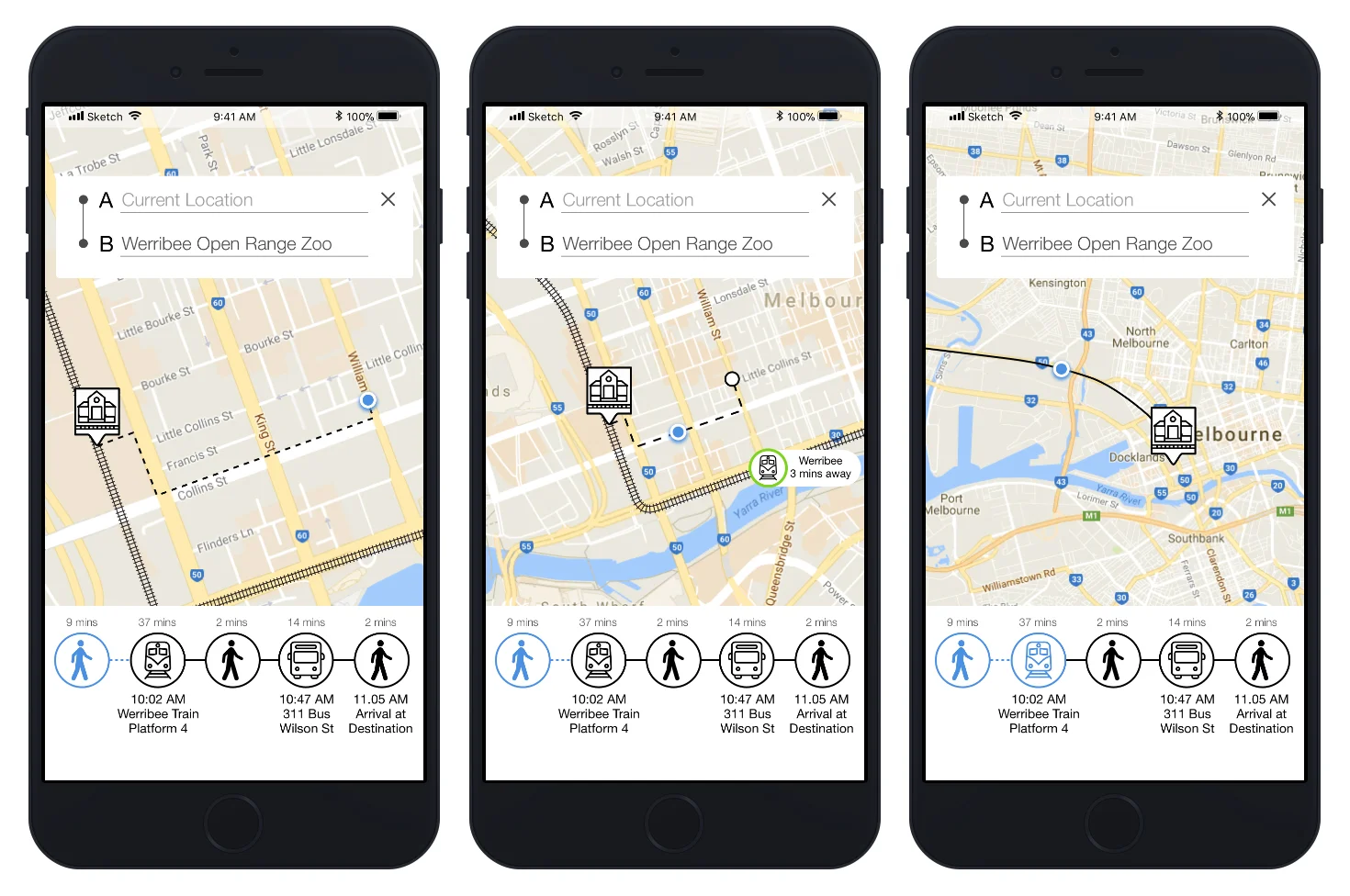
    walk_screen_iterate.jpg
     
     
    • Users did not understand they could swipe between steps to check what step was next. I completely removed the swiping function because of this feedback.
    • Users wanted to see the whole journey and what part of the journey they were up to. Users can still click into the step they were up to in order to get detailed information.
    • More confusion around iconography, as users were not sure if the icon is a train station or a live tracked train. I experimented with different icons.
     

    Final Prototype


    Going Forward with Prototype

    There are still a few parts of the prototype I would recommend testing.

    • More testing around iconography to make sure users understand the difference between stations and live tracked transport.
    • Need to test how willing users are to let the app track your movements for the payoff of personalised notifications and interface details.
    • Test if users use the walking or cycling options with current incentives.
    • Need to test if it is clear what is a bike share option and what is a personal bike option.

    Potential Future Features

    Taking personalisation to the next level.

    • Calendar access: Predicting the journey before you even begin by giving the app access to calendar appointments to notify when to leave to get there on time.
    • Setting health goals: Inputting goals such as the number of calories to burn and the app will incorporate walking or cycling into your commute to meet your goal.
    • Journey planning based on weather preferences and type of journey: For example, commuting to work or commuting on the weekend to something fun.

    Key Learnings

    I learned not to get attached to ideas you think are conceptually amazing because when you put them in front of people to test they can crash and burn. Our role as designers is to objectively create experiences our users love without ego and pushing what we personally like. We can do this really effectively by doing user research, prototyping and testing. When you do get that great feedback that validates your idea you know you're on the right track and when you test early and find out your idea isn't working you haven't invested too much time anyway.